Screen 01
Caption — what this screen does, in one line.

One paragraph that frames the project: what was the brief, what shape did the work take, what changed because of it. Replace this copy when filling the template in. Below: primary, secondary, and tertiary calls-to-action — point them at a live demo, a deeper case study, and the brand site.
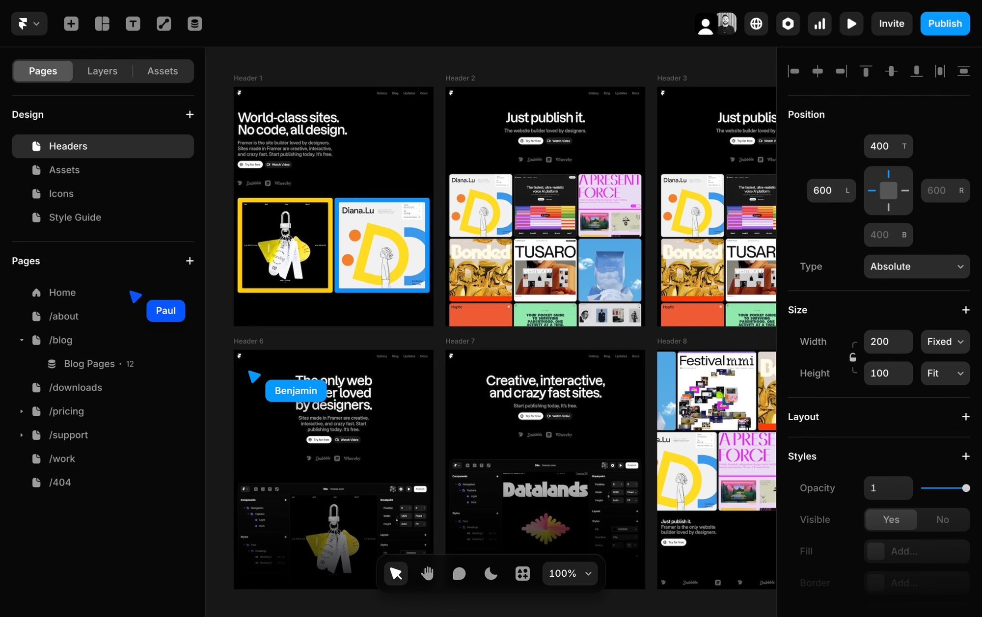
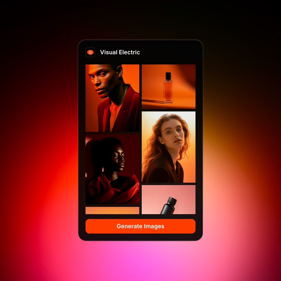
Nine screens stacked in a soft three-column mosaic. Each tile drifts at its own speed as you scroll, so the page feels alive without leaving the page.
Caption — what this screen does, in one line.
Caption — the second beat of the flow.
Caption — the third moment worth slowing down on.
Caption — a key state, ideally the one users miss.
Caption — the close. What the user feels at the end.
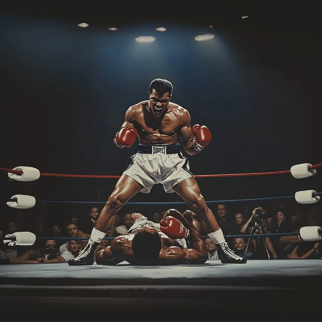
When a single decision matters more than a flow, the page slows down with it. Up to five pins, each with a one-line label.
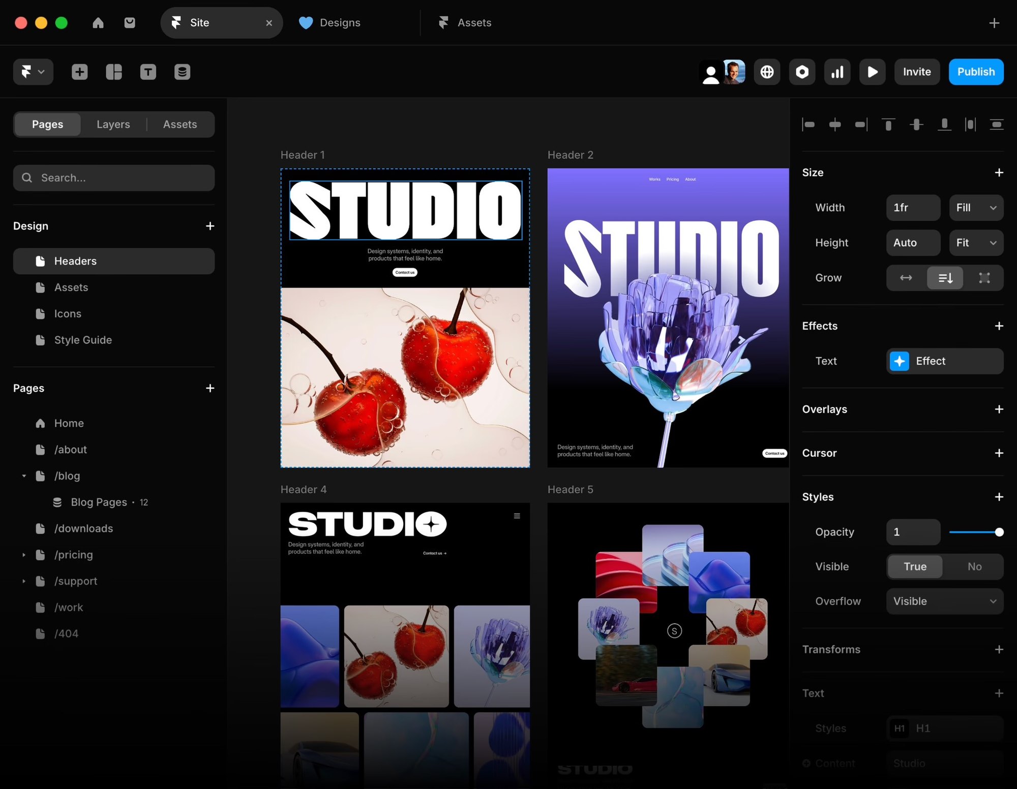
Four CSS-only card variants. Tap the stack to fan it open. Useful for card programs, multi-tier products, or any "same product, different finish" story.
A paragraph of placeholder copy describing the first state. Three or four sentences works best — enough to give the phone something to hold against, not enough to crowd it.
The middle moment. Show a decision, a transition, or the part of the flow most users misread. Pair with a screen that shows the change clearly.
What the user gets. The frame should feel like resolution; the copy should name the moment plainly without overselling it.
An optional fourth step for flows with a quiet, confirming ending. Keep symmetric with the screens — four steps, four images.
Short label
Short label
Short label
Short label
Short label
Short label
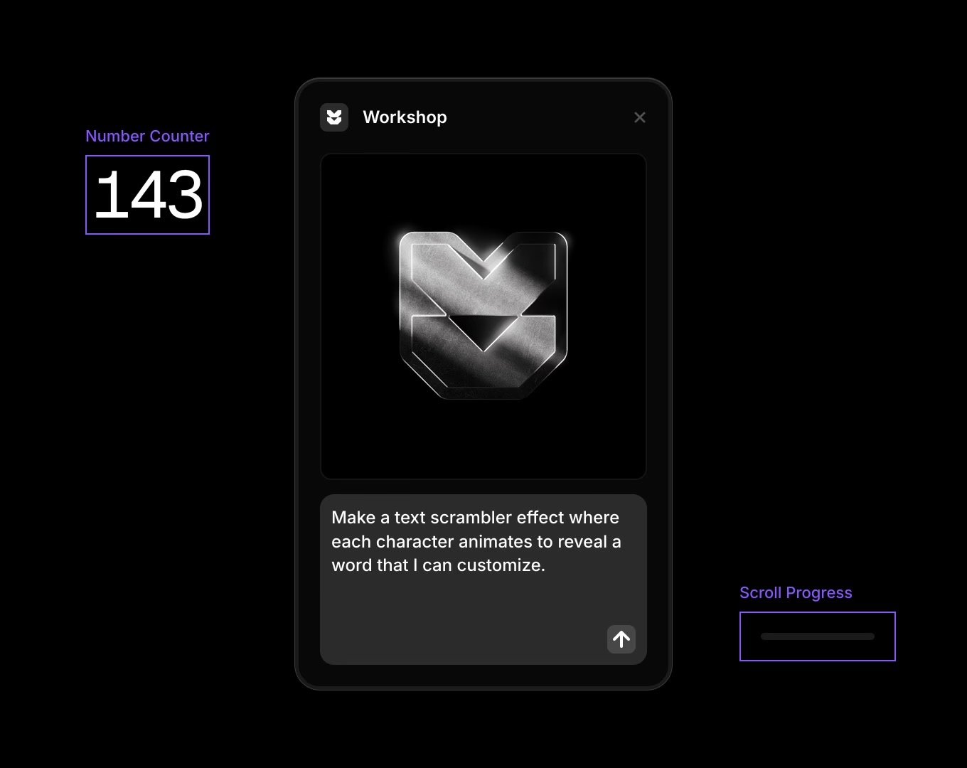
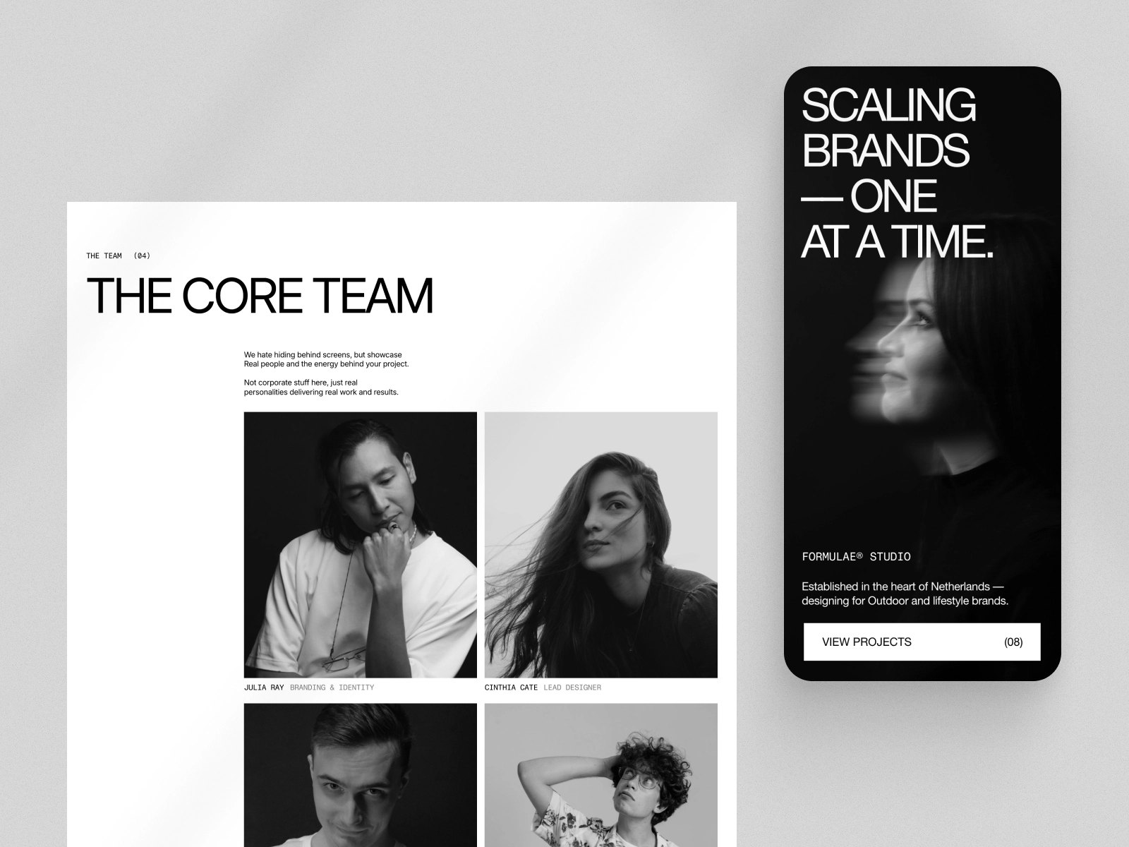
Use this block when a section needs three or four paragraphs of long-form copy alongside a quiet visual companion. The phone stays glued to the lower-right corner — close enough to see, never close enough to crowd the words.
Inside the phone is a four-frame stepper that loops in the background. Swap the frames for screens that match each paragraph; the autoplay is deferred until the section enters view, so the phone is still on its first frame when the reader arrives.
Reach for this when the work is about the words as much as the screens — a design rationale, a behind-the-scenes process note, or a long quote from the team. The pattern is borrowed from the long-read journalism we keep coming back to.
Drag the divider to compare. Use for rebrands, dark/light modes, screen redesigns — anywhere a single before/after frame is more eloquent than two stacked images.

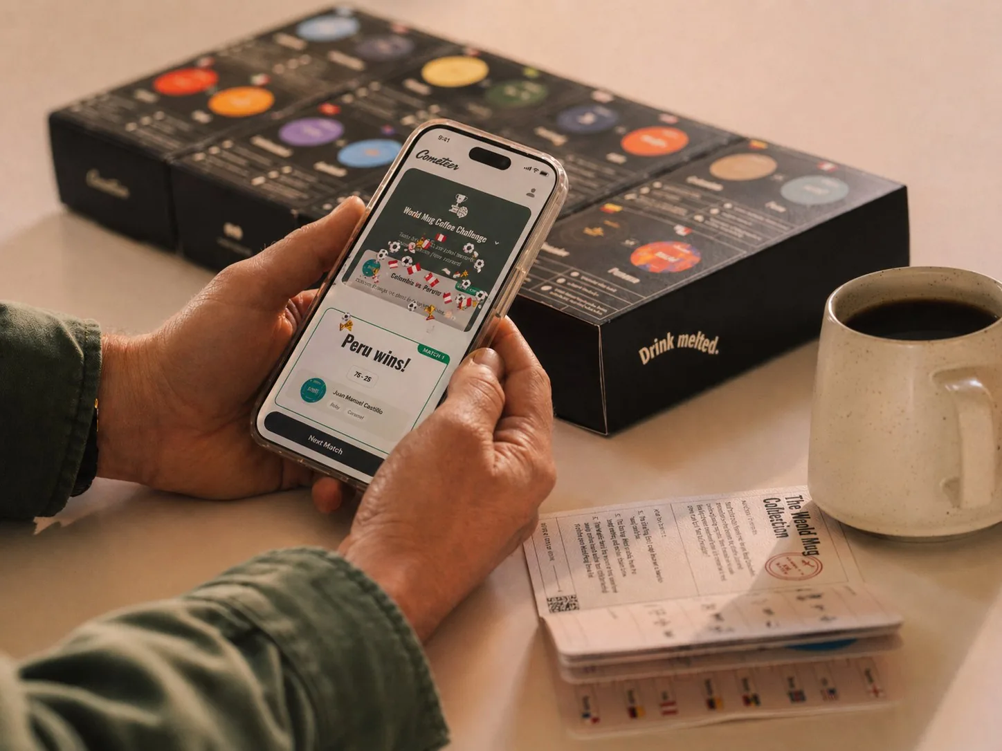
Eight-week sprint making on-chain rewards feel like a familiar earn-and-spend rhythm.
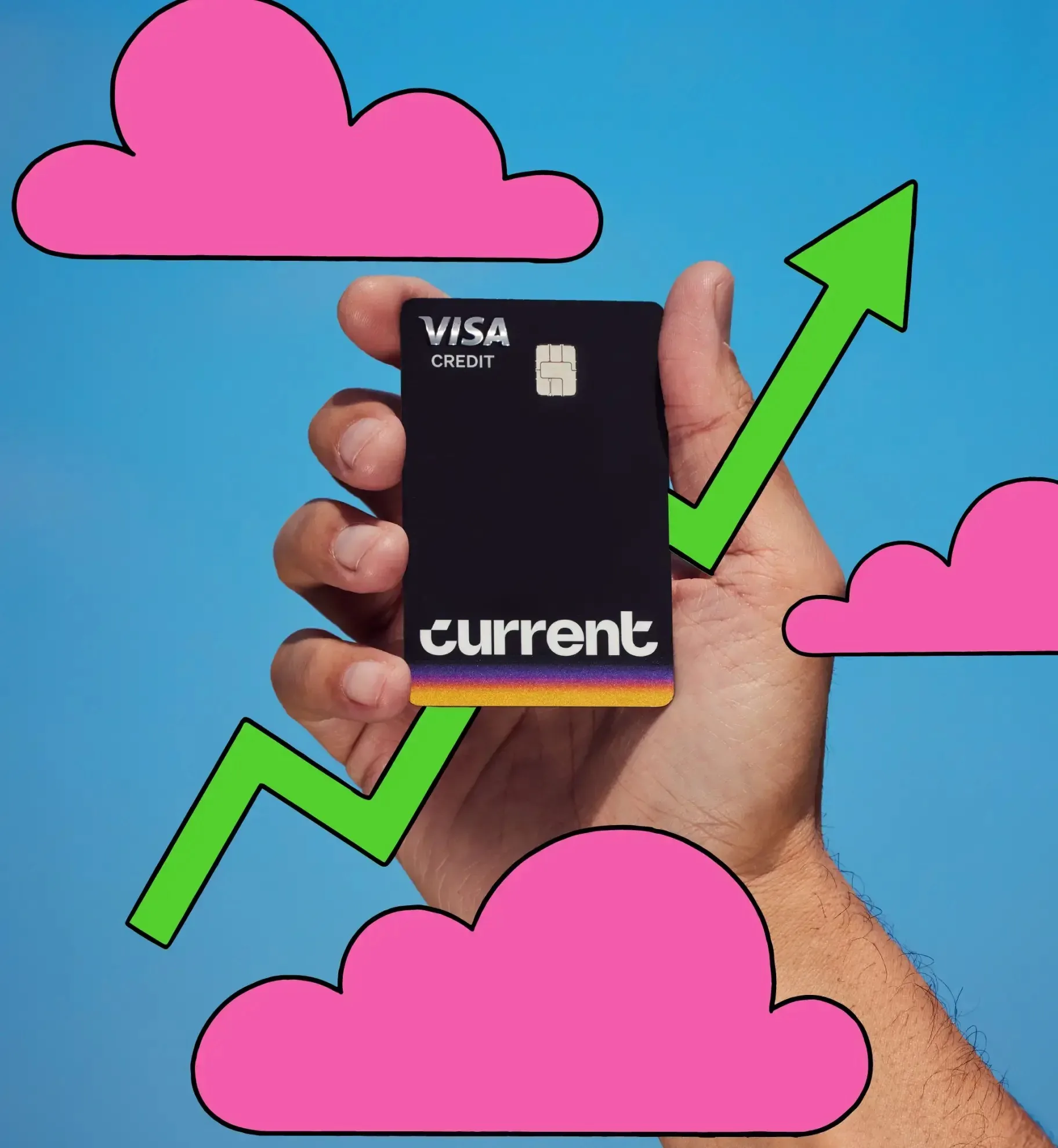
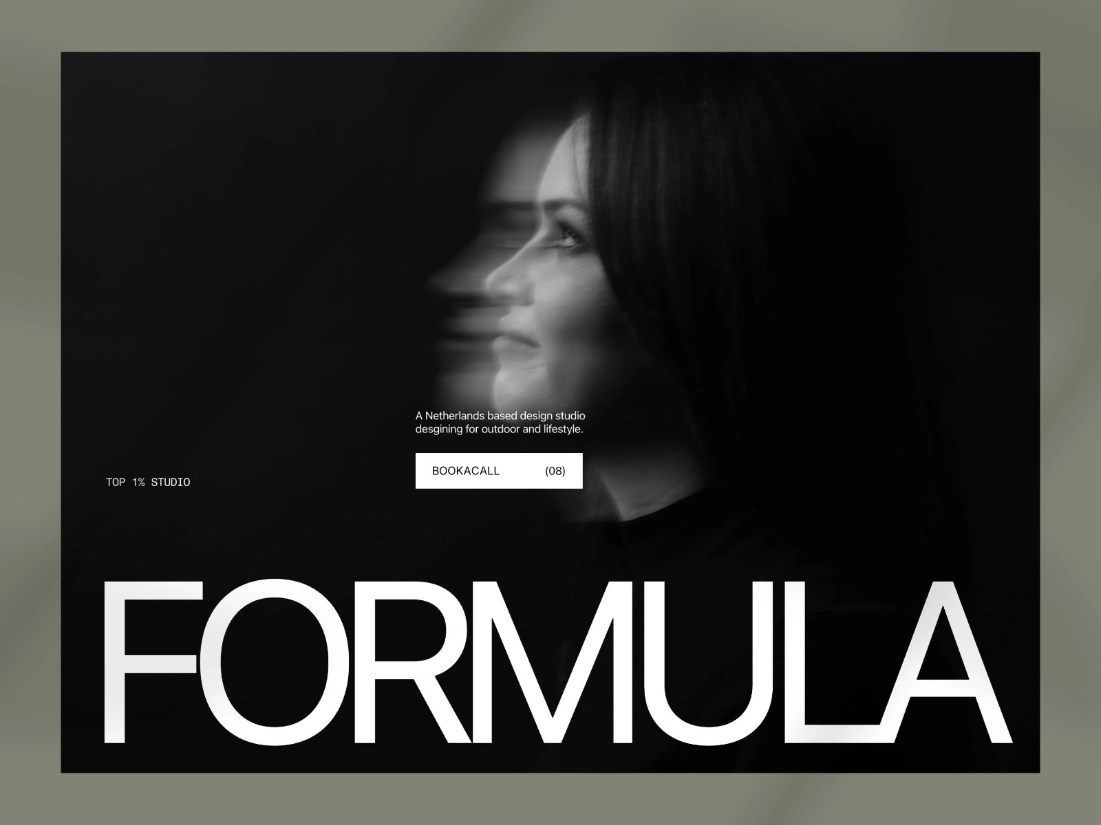
Brand identity and digital direction for Current's modern reintroduction.