Screen 01
Caption — what this screen does, in one line.

Two-tap booking flow redesign for Glamsquad's at-home beauty service.
Caption — what this screen does, in one line.
Caption — the second beat of the flow.
Caption — the third moment worth slowing down on.
Caption — a key state, ideally the one users miss.
Caption — the close. What the user feels at the end.
When a single decision matters more than a flow, the page slows down with it. Up to five pins, each with a one-line label.
A paragraph of placeholder copy describing the first state. Three or four sentences works best — enough to give the phone something to hold against, not enough to crowd it.
The middle moment. Show a decision, a transition, or the part of the flow most users misread. Pair with a screen that shows the change clearly.
What the user gets. The frame should feel like resolution; the copy should name the moment plainly without overselling it.
An optional fourth step for flows with a quiet, confirming ending. Keep symmetric with the screens — four steps, four images.
Drag the divider to compare. Use for rebrands, dark/light modes, screen redesigns — anywhere a single before/after frame is more eloquent than two stacked images.
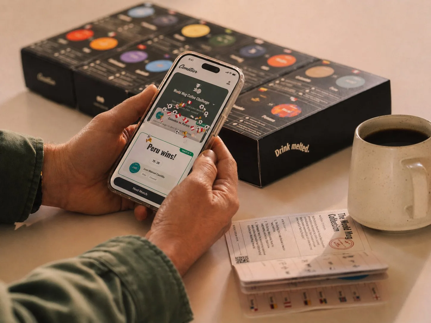
Brand and digital direction for the cult-favorite frozen-coffee delivery service.

Brand and product editorial across Monzo's launch, growth, and maturity stages — including a live activation-agent prototype that decides when to ask, when to act, and how to recover (Demo →).